


How do you decide on the colour palette for your hotel décor?
Do you use the colours from your branding, highlighting the key shades and integrating different tones of those colour into the surrounding walls, furnishings, and details?
Do you opt for colours which mimic the location – from blue and white for coastal hotels to bright blocks of colour for a cityscape?
Or are you looking for specific colours that nurture the perfect guest experience, and which make guests feel calm in certain settings and inspired in others?
In this blog post, we’re focussing on the importance of colour in your hotel design and how it impacts the guest experience.
How is colour linked with experience and emotional reception?
Have you ever noticed how different industries use different colours to frame the consumer reaction, experience, or feeling when using a product or service?
White is, for example, a colour associated with serenity, with health, and with relaxation.
Green is a colour linked with the great outdoors and with healthy choices, while red is the colour of romance and passion.
Colour psychology is an entire field which people can spend years studying – but here is a quick guide to what it means in the hospitality industry and how it can be used to curate the ideal guest experience.
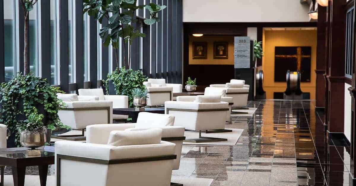
In short, the colours that you decorate and dress your hotel in are going to evoke emotions in the guests that come through the doors. A white-centric hotel with opulent gold details and marble surfaces is one which is likely to inspire feelings of luxury and wealth. Meanwhile, a very brightly coloured hotel can feel playful, while a blend of pastel shades can create outdoors-y and ‘beachy vibes’ for your guests.
The real impact comes in how you connect these colours throughout the entirety of your hotel, linking the reception and communal spaces with bedrooms and with the separate areas for different activities.
The best colour tones for different areas of your hotel
This is where it becomes important to start connecting those emotional responses and experiences with the different areas of your hotel – considering how you want guests to feel at different points in their journey through your hotel.
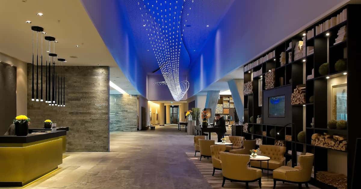
The entrance of your hotel, for example, is responsible for curating that first impression that underpins every experience that follows. It is, undisputedly, the best place to introduce guests to your brand and to the experience that they can expect – with colour best used subtly but creatively, in the décor and furnishings throughout the space.
It’s also crucial to consider how colour is affected by light, and how the combination of natural and artificial light in different areas of your hotel affects the way colour is perceived. To stick with your reception, if this is a light and airy space then colours appear bright and vibrant – however, those same colours can look completely different in an intimate bar or restaurant setting onsite.
That’s not to say that you can’t use the same colours in these different locations – rather, that using them in specific and deliberate ways is a much better way of creating subtle but impressive cohesion across your space.
Making colour work for you, your brand, and your guests
Creating a balance between standing out and offering an experience that guests expect is difficult and requires you to deliver what they want and more. One way that we do this is by uniting the use of colour with different textures – perhaps adding brand colours through floral arrangements or fabrics.
Whatever you decide to do, and however you choose to use colour in your hotel, Carroll Design are here to help.