


What makes you first enter a bar and decide to stay for a drink?
It’s probably a combination of the menu / drinks on offer, and the overall vibe of the bar in terms of its design and the environment.
Design and the way your bar is presented plays a big role in securing customers who want to stay and enjoy the experience – perhaps ordering a second drink, or even making a return visit on another occasion. So, what part do colour and textures play in that aspect of design?
How does colour psychology work in commercial design?
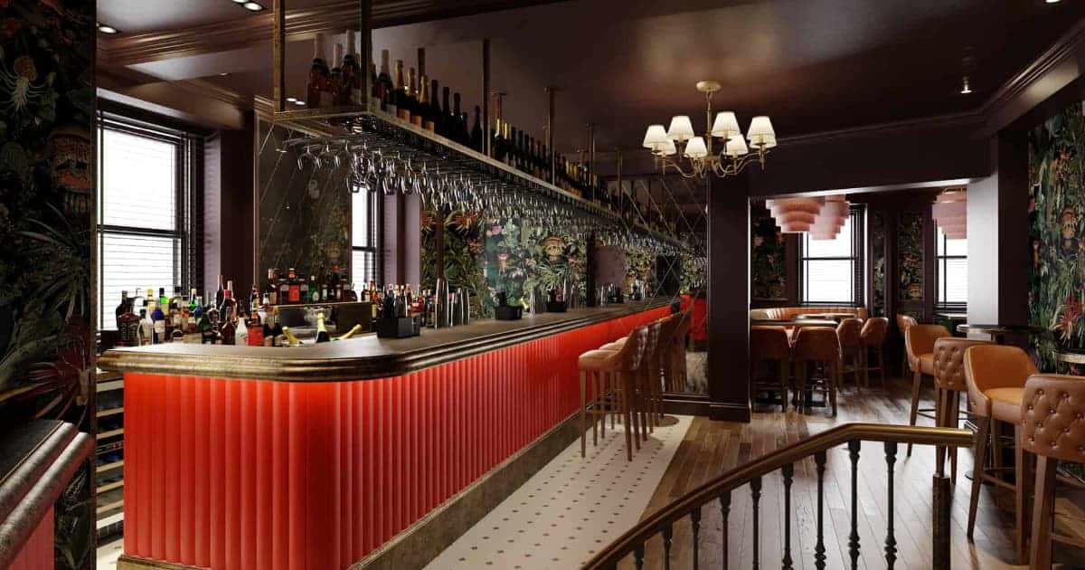
When we talk about the psychology of colour, we focus on the way that different colours make people feel – something which is of particular importance across commercial spaces. For example, red is considered to be the colour of passion and has very specific connotations when it comes to bold romance or intense anger. Conversely, white is the colour of purity and denotes innocence, clean and clinical spaces, or angelic energy.
In the same breath, it’s also pertinent to look at how colour is used in marketing. For example, green is often used by companies as a way to symbolise health or environmental benefits – and can be rather misleading when used to signify supposed natural connections which are not necessarily there. This particular example provides a look at how colour psychology can be used as a ploy to carry consumers in certain directions with regards to their experience and selection – with more and more companies tapping into a concept known as ‘greenwashing’ which adds green to their marketing and packaging in an attempt to make their product look healthier or appear as the ‘green alternative’.
When you really stop to think about it, colour psychology is used across everything from interior design to branding, product design and more.
So how does it, and the addition of texture, impact and frame the design of a bar?
How important is colour in bar design?
The colours that surround consumers when they eat or drink can have the power to make them spend more, to make them feel more relaxed or energised, and to feel certain emotions during interactions with the bar itself and with their group.
Pink and red, for example, are typically energetic and feminine colours – while richer and darker colours create an intimate setting which is ideal for date nights and romantic occasions. Yellow is a bright and bold colours which denotes a very positive experience, while blue is a fresh colour which is used in buckets across coastal and outdoors spaces.
And it doesn’t end there. Once you start mixing colours, it’s important to recognise how certain shades and tones relate to others and how they change in the presence of other colours. Is one colour a standout which forms the basis of the design? Do the different colours throughout a space compliment or contrast against each other?
And finally, what role does texture play alongside the different colours throughout a space?
How important is texture in bar design?

Texture is an integral part of the design of a bar because it refers to every single material that you integrate into the space. From the fabric across the chairs to the design of the bar itself, whether you opt for wallpaper walls or classic painted surfaces, and whether you keep your space light and bright or dark with rich opulent textures, the materials you use work alongside colour to create a mood.
For example, using lots of natural wood is a good way to create a rustic and relaxing bar, which taps into spa vibes and feels like a traditional log cabin. Dark and varnished wood meanwhile uses the same core material but in a way which is much grander – similar to that used in an old building. Using lots of metal and exposed concrete creates a very industrial aesthetic, while lots of white surfaces and angular edges make a space feel incredibly modern.
And this carries over into the textures used across the furnishings and features of your bar – all contributing towards the comfort and overall mood. Leather is a typically quite classic and elegant material, while velvet is incredibly luxurious, and tartan or tweets taps into a very specific country theme.
Paired with colour, texture is what brings the setting of your bar together and connects the furnishings and features with the space itself. Selecting colours which compliment the textures and the overall setting is integral to designing and bringing to life a cohesive space which makes sense for guests, and which gives them the experience that they expect to enjoy.
For more information and advice on bar interior design, the team at Carroll Design are here to help. Get in touch to find out more.